When a company or a government goes down the path of rebranding, the first question that arises is: how much is it going to cost the business or the ratepayers.
The second is: what will be the benefit of changing a logo.
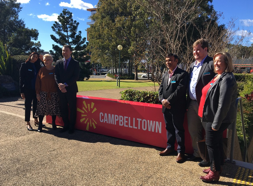
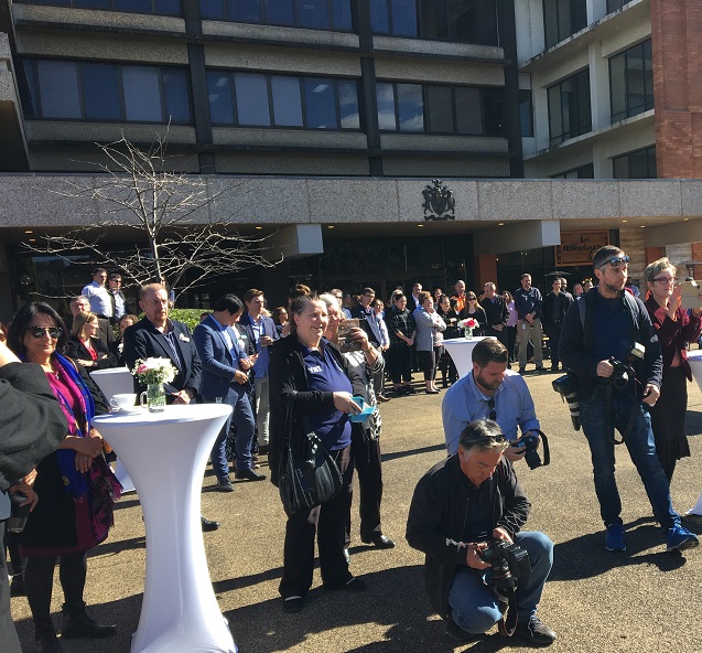
Local radio personality Josh Webster told this morning’s launch of Campbelltown City Council’s rebranding campaign and new logo reveal that’s exactly what he thought when he first heard about the exercise.
“Oh, I wonder how much this is going to cost,’’ he told those attending the launch.
“But having been part of the workshops and looking at the finished product – and seeing that it is much more than just a new logo I have to say that it’s worth it,’’ the radio man said.
More than 1000 people were involved in the development of the brand during six months of community consultation, speaking about their lived experience of Campbelltown through workshops, focus groups, interviews and surveys.
It’s well documented that consultants were paid $350,000 to come up with a new logo (pictured above) and rebranding of Campbelltown that will market the town in a positive new light.
That’s exactly what Mayor George Bbrticevic thinks is the final result of the rebranding exercise, saying this morning that he was “proud to be here because this is more than a logo.
“This is about community pride and saying to the world Campbelltown is open for business,’’ he said.
He said the new Campbelltown brand represented the welcoming, direct and generous nature of the community.
“The time is right for our community to tell its own story within the changing Western Sydney landscape,” he said.
“This new identity belongs to everyone in our city. Our community told us what an honest representation of modern Campbelltown looks like and we have listened,” he said.
“Campbelltown’s natural landscape, people, connectivity, culture and businesses often surprise visitors.
“We are going to be more bold, direct and clear about what’s happening here so that everyone who comes into contact with us is left knowing how great this place is.
“This is just one step in achieving a broader vision for Campbelltown’s future.”
He listed Re-Imagining Campbelltown, Macarthur FC Bulls and Campbelltown Billabong as examples of great things starting to happen in Campbelltown
Council says the logo symbolises the city as a meeting place for people from around the globe, coming together to welcome and inspire each other, and then bringing their own opportunities to life.
It shares inspiration with this Dharawal land, through its linkages to the natural environment and its spiritual connection to the place and its surroundings.
The stylised “C” represents a city bursting with potential and how people from all works of life can come together to create opportunity in many shapes and forms.
The complete identity includes a new visual design and language style guide for promotional and communications material for the city that will be implemented this year.

i like the old one it looks better